Tradition and Typography
The overall design must be clean and simple while providing a balance to the chaotic, bright, and energetic motion found in the illustrations. It must allow the viewer to be transported into the work, allowing them to become engaged and interested without being distracted by interface elements such as navigation and controls. The project must also be easy to use and simple in its navigation conventions.
Tradition is fused into the project by incorporating elements of the past into a new media environment. The illustrations provide references to the past and to artistic traditions of the modern era—elements of Renaissance painting are combined with contemporary ideas and methodologies. Strong adherence to geometric constructions, compositions, and patterns also bring tradition into the work.
The viewer of the work must sense the influences of the past, but at the same time, the viewer must unmistakably know that the work is contemporary. This idea of looking to the past for influence while creating a contemporary work would become a major influence in the graphic style of the project. Stanley Morison, a 20th century typographer, described this idea as:
“…the reconciliation of the old craft with the modern spirit.”
— Stanley Morison
Jonathan Barnbrook, a contemporary type designer, provides some excellent typefaces and a philosophy that support the idea of fusing classical and historical elements with modern ideas. He talks about his process and sources for inspiration. He is often inspired by historical letterforms and designs, which he interprets into very contemporary looking typefaces. He says:
“It is important though not to just copy from the past, but to assess it in a contemporary way.”
— Jonathan Barnbrook
This would become the general spirit of the design of my project, and a shift from my earlier thinking. I wanted the Cosmic Knot to appear and act like a contemporary work. I did not want the work to be an imitation of some historical style—it needed to be original and new while still showing a clear influence from history and tradition.
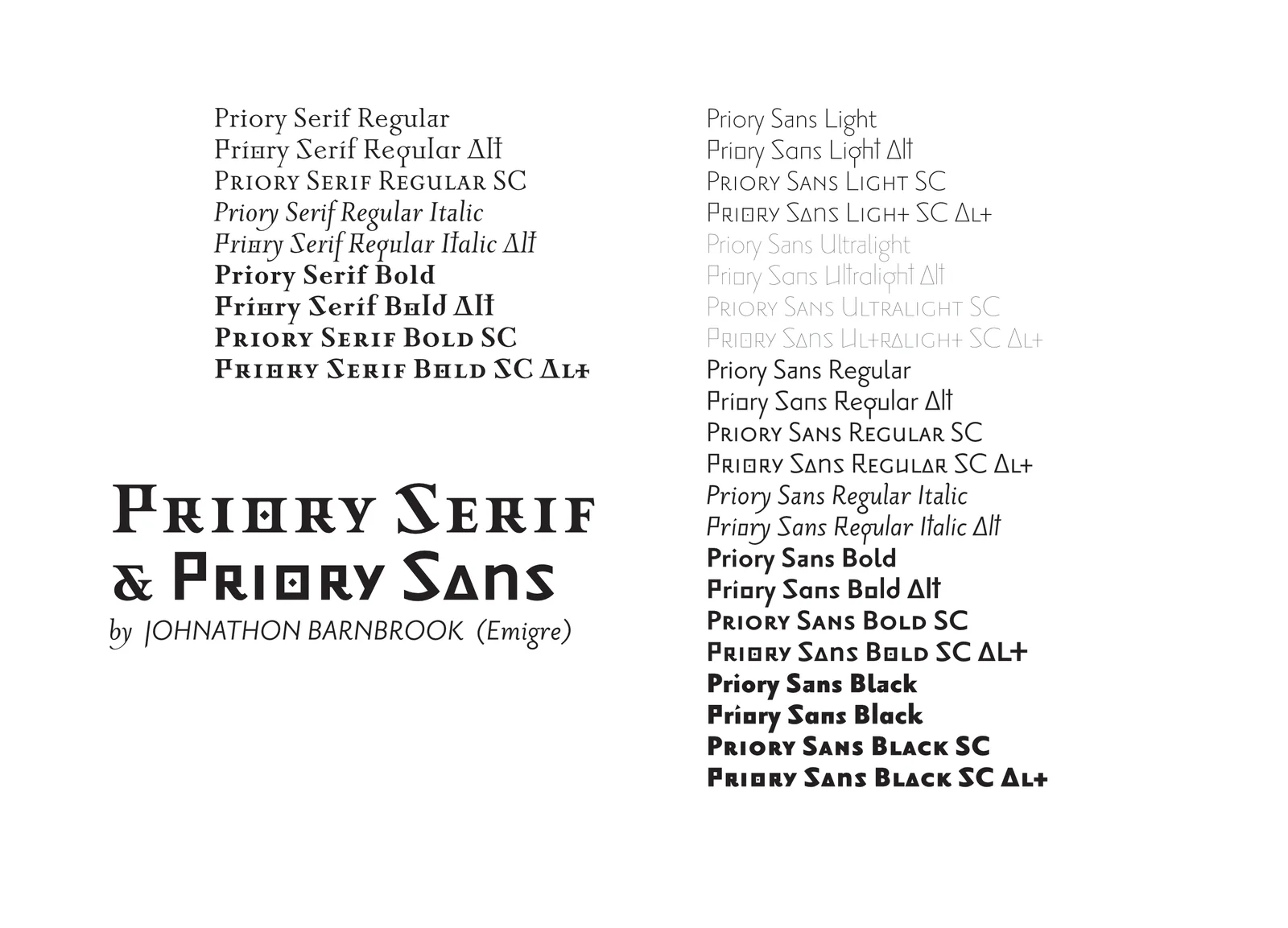
I chose Jonathan Barnbrook’s Priori as the primary typeface for my project. This typeface provided the character that I hoped to communicate, rooted in classical form with a very contemporary approach. I was also drawn to the flexibility of the font, the inclusion of sans serif faces, serif faces, and extreme versions, allowing for a variety of typographic treatment. The typeface also included a useful alternative version with unique styles that I felt would contribute.
The Light and Ultra-Light versions became my favorites. The thin characters felt very contemporary and complemented the design and focus on line within the illustrations and graphical representations in the project. I also extended the type by creating my own decorative initial caps using the knot motifs.
Decorative capitals were created using the knot motif, extending the Priori typeface and adding a stylistic element reminiscent of medieval manuscripts. The styling of the knot decoration is adapted to display a contemporary feel.
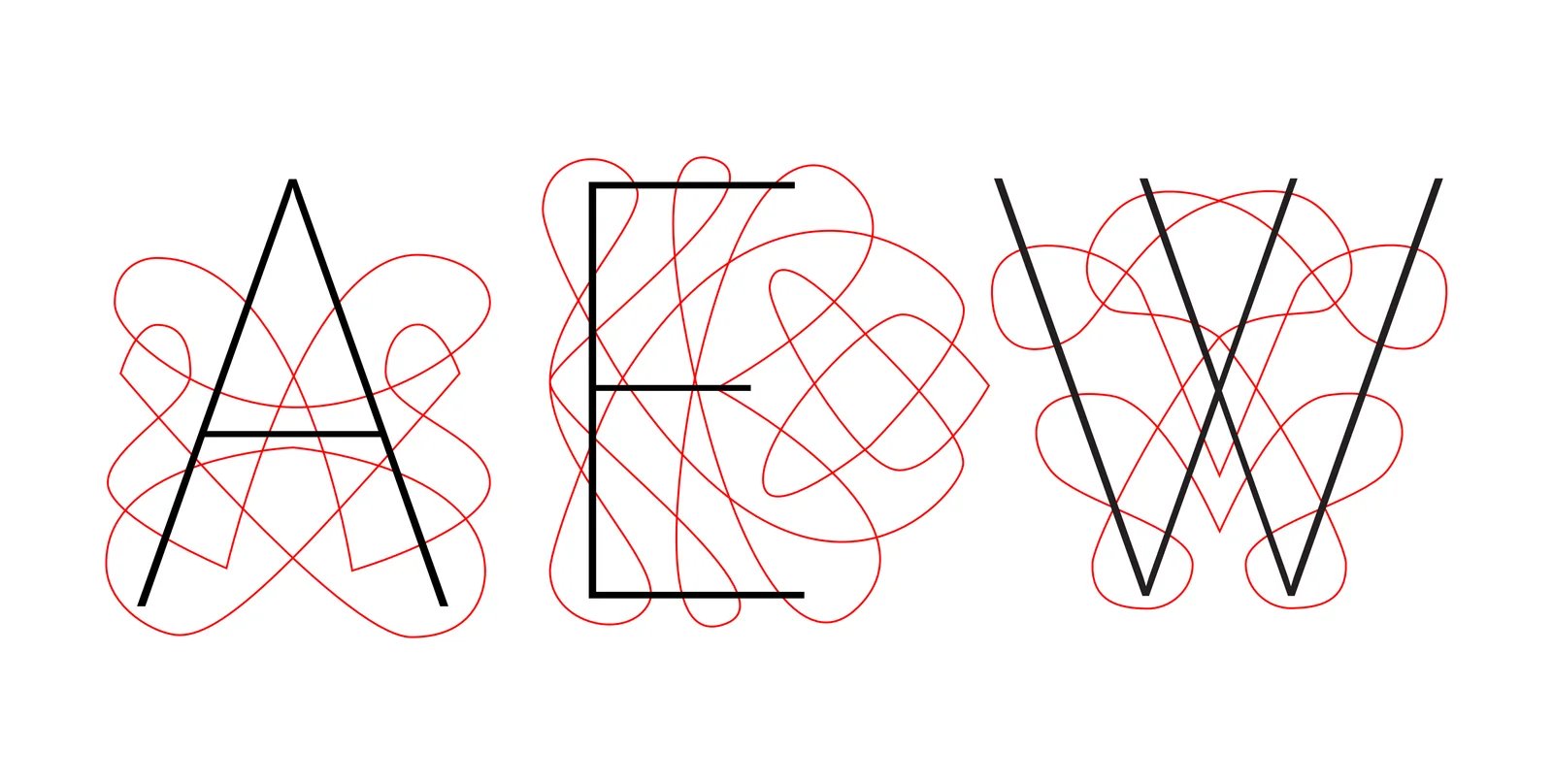
Decorative capitals were created using the knot motif, extending the Priori typeface and adding a stylistic element reminiscent of medieval manuscripts.